
HOW TO BUILD A SUCCESSFUL NEWSLETTER
Bob Hatschek
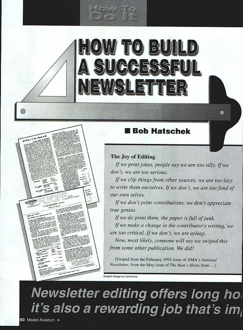
The Joy of Editing
If we print jokes, people say we are too silly. If we don't, we are too serious.
If we clip things from other sources, we are too lazy to write them ourselves. If we don't, we are too fond of our own selves.
If we don't print contributions, we don't appreciate true genius.
If we do print them, the paper is full of junk.
If we make a change in the contributor's writing, we are too critical. If we don't, we are asleep.
Now, most likely, someone will say we swiped this from some other publication. We did!
(Swiped from the February 1995 issue of AMA's National Newsletter, from the May issue of The Ram's Horn, from ...)
Editor's note: The author spent many years as an editor for various technical publications, is a contributing editor for American Machinist, and founded his club's newsletter, Flyoff.
It's true. It's all too true! And any model club's newsletter editor will confirm every word of it!
But publishing a newsletter is one of the most valuable contributions a member can make to his club. At the very least, it keeps members aware of club doings; it spark-plugs the organization's activities; and it welds the group into a cohesive whole—even if meeting attendance does leave something to be desired.
Beyond that, a well-crafted newsletter can contribute to the knowledge and skills of the members. It can be a valuable source of ideas, tips, model designs, gadgetry, etc. It can be a valuable tool for gaining new members. And it can help to fatten the club treasury.
Producing a club newsletter is no snap job. It's a tremendous challenge. The pay is lousy! Yet it can be very rewarding.
Here are some thoughts and ideas — in random order, because they're all important:
Title
One of the first things to do is name the baby. Keep it in character. Use humor. Brag a little. Double entendre is good. But keep it short.
I selected Flyoff as the title for the Skyscrapers' newsletter because it suggests competition; because the flyoff is the most exciting part of a free-flight contest; the word implies controversy; it's a decisive action.
Size
Most club newsletters consist of a number of 8 1/2 x 11 sheets with a staple in the upper left-hand corner. That's standard US letter size and it fits any photocopying machine—which seems to be the way most club newsletters are "printed." The number of such letter-size sheets in the typical newsletter is four or five, because five sheets weigh just less than an ounce and most newsletters are circulated by First Class Mail. One more sheet requires 23 cents more postage. Thus the typical newsletter printed on both sides is an 8- or 10-pager.
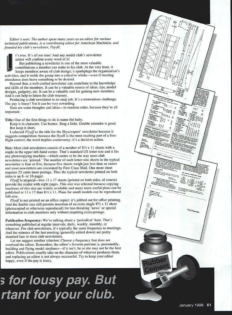
Flyoff is atypical—two 11 x 17 sheets (printed on both sides, of course) provide the reader with eight pages. This size was selected because copying machines of this size are widely available and many more useful plans can be published at 11 x 17 than 8 1/2 x 11. Plans for small models can be reproduced full-size.
Flyoff is not printed on an office copier; it's jobbed out for offset printing. And the double size still permits insertion of an extra single 8 1/2 x 11 sheet (photocopied or otherwise reproduced) for late-breaking "news" or special information to club members only without requiring extra postage.
Publication frequency
We're talking about a "periodical" here. That's something published at regular intervals: daily, weekly, monthly, or whatever. For club newsletters, it's typically the same frequency as meetings. And the minutes of the last meeting (generally edited down) are pretty standard fare in most club newsletters.
Let me suggest another criterion: choose a frequency that does not overload the editor. Remember, the editor's favorite pastime is, presumably, building and flying model airplanes—if it isn't, he or she may not be the best editor. Publications usually take on the character of whoever produces them, and replacing an editor is not always successful. Try to keep your editor happy, even if the pay is lousy.
Flyoff originally proposed to start as a quarterly (published every three months) and "then expand to bimonthly (every two months) and eventually monthly as more material becomes available." That optimistic assumption, unfortunately, never came about and Flyoff remains The Skyscrapers Quarterly after nearly eight years of otherwise-successful publication.
The term "quarterly newsletter" is an oxymoron. News has a time value, after all, and every three months hardly seems journalistically fast-paced. But to call Flyoff a journal would also be misleading, because that word implies a heft that eight pages just doesn't deliver.
Mechanics and typography
Putting a newsletter together can range from low-tech to the highest. Most club newsletters are simple paste-ups: text and illustrations are produced on many separate pieces of paper, which are cut out and pasted onto "master" pages. These are reproduced by photocopier or offset printing, then are stapled and mailed.
You need some way to get legible words onto paper fairly easily: a typewriter at least, or a word-processing system of some kind. It's likely that someone in your group has a home computer—and that makes him or her a prime candidate for editor. It's also probable that the computer has some word-processing software and is connected to a printer of some kind. Even though it might be convenient, you don't need $495 desktop-publishing software. Let's consider options.
Remember, we're thinking about 8–10 pages (four or five sheets, printed both sides). If we're really serious about content, that isn't a lot of space. And type takes up more space than you may realize. Ordinary typewriter type is either 10 characters to the inch (so-called Pica size, which is rather old-fashioned) or 12 (Elite). That's 75 or 90 characters across an 8 1/2-inch page with 1/2-inch borders. And only five (Pica) or six (Elite) lines of type per inch of depth.
Multiply it out: If the page's useful depth is 10 inches, you get 50 lines of 75 Pica characters (= 3,750 characters) or 60 × 90 = 5,400 Elite characters. Believe it, that isn't as much. Including title, there are perhaps 3,000 words in this article—maybe 24,000 characters. (Editor's note: Bob, that was before I started hacking up your text! Ha!)
There's an easy fix. Many copying machines can reduce images—especially to 77% or 65%. Elite type reduced to 77% is still highly readable and gives 15.6 characters per inch across the page, 78 lines down—up to 9,126 characters.
A home computer with word-processing software yields even better options. Many different type designs (called fonts) and sizes are available. These include typical Pica and Elite varieties, but hundreds of others are also available.
Suffice it to say that there are two broad categories of type:
- Text faces: designed for quick-and-easy reading and feature serifs—those little strokes across the ends of letters that help guide the eye along a line of type.
- Display type: typically sans serif (literally, without serifs), usually bold, and designed to be read from a distance. It's typically used for headlines, captions, subheads, and other places where relatively few words stand alone.
Type size and spacing is measured in points (72 points = 1 inch). Flyoff is produced on an ancient Macintosh computer (almost seven years old) using WordPerfect (version 1.0.2) software. Text is 10-point Times Roman type (usually with 1 kerned point of space between lines), yielding about 60–65 lines vertical on the page. Headlines are set in Helvetica Bold in a variety of point sizes. These particular type faces are virtually classics for these uses.
Actually, 10-point type is fairly large. But Flyoff copy is produced on a dot-matrix printer with a resolution of only about 72 dots per inch (dpi). If I had an ink-jet or laser printer with 300 or more dpi resolution, I could probably reduce type size to 8- or 9-point and get still more words in without losing readability.
Layout and makeup
One mistake many amateur editors seem to make is to try to pack too much information onto each page; white space is the friend of legibility.
Another mistake amateur editors make is to make newsletters look like letters or books and spread type unbroken across a whole page. The reader's eye has difficulty following this and it really slows down reading. That's why all newspapers, most magazines, and even some large-format books are set in relatively narrow columns.
For an 8 1/2-inch page width, the optimum column width is in the range of two to four inches, although it's generally measured in picas (one inch = 6 picas; 1 pica = 12 points). Thus, standard-size magazines, such as Model Aviation and our typical newsletters, use either two-column or three-column makeup, with typical column widths of about 20–21 picas (3 1/3 to 3 1/2 inches) or 12–13 picas (2 to 2 1/6 inches), respectively.
Either is highly readable—especially if fully justified (spaced so that both left and right edges of each column are even). But remember that we will probably also want to include illustrations: photos, sketches, cartoons, etc.
If all type is in columns of uniform width, two-column makeup gives us the choice of full-page or half-page width for illustrations, and three-column lets us select from full-page, 1/3-page, or 2/3-page widths for illustrations.
Other choices include "bleeding" the illustration (running it out to the edge of the page), "floating" it (using extra-wide margins), or running the text around it (setting part of a column to non-standard width, for example).
But three-column is probably the most economical of space with a minimum of required manipulation, unless you have some high-powered desktop-publishing software (which we won't go into here).
Illustration
Drawings are mandatory in any model aviation publication; photographs are not. Many people will deny that statement and quote the old saw, "One picture is worth a thousand words."
Well, drawings are pictures, aren't they? And a photo is only useful if it illustrates something, if it clarifies an idea made in text, or if the subject's mother can recognize him or her! A magazine can use photos just because they look pretty; a newsletter usually doesn't have enough space for this, and rarely has the capability of really sharp reproduction.
The big trouble with most photos is that they are too often used for the wrong reasons: to fill space or to stroke somebody's ego (the photographer's or the subject's). The second-biggest problem is that they're not selectively composed and/or cropped, and they're not published in an appropriate size.
For whatever reason, the editor has failed in his duty to eliminate some of the chaff that doesn't really deserve publication. And many modeler-editors seem not to be very good judges of photography. Or they don't want to hurt a friend's feelings. A good editor may have to.
On the other hand, most modelers do know how to read a drawing. And they're reasonably good at making readable drawings—surely adequate for most newsletters.
Drawings do not have to be inked to reproduce well. If you photocopy a drawing made with a sharp pencil on smooth drafting vellum or Mylar (or even shelf paper) it will reproduce almost as well as an inked drawing. But make sure the lettering is legible. It's also possible to type up the callouts for a drawing and just paste them on. And don't forget: unless the plan is full size, make sure that it includes all necessary dimensions (or at least a scale) so readers can enlarge the drawing to full size.
One thing that tends to make amateur publications look amateurish is their tendency to fill space inappropriately. This is typified by cartoons reproduced full-page or half-page when they should be reduced to perhaps a two-inch square, or a full-page contest notice that could have been reduced to a quarter-page. Filling space this easy way is a seductive temptation as any deadline nears. But avoid it like the plague, because it's cheating the readers.
Content and getting it
The primary consideration in any communication is the audience. Who's going to read this stuff? Why? How much does the reader already know?
Knowing the answers to such questions enables the editor to decide what's appropriate. Then he has to go after that kind of content. And the toughest part of producing a newsletter is getting things to put in it. It usually takes nagging.
One helpful technique is to pick a reader—real or imaginary—as "typical" and imagine what would interest that person. Then go after that kind of content.
Many newsletters put major emphasis on club news:
- Meeting minutes
- The last fun-fly
- Contest results
- Who's doing what
- A bit of humor
- A few brief building or flying tips
That's fine and it all belongs, but it is rather limited. It limits the potential readership of the newsletter to club members only. If that's your goal, fine. But if you have a broader target in mind, you have to broaden the content.
In editing Flyoff I take the position that my fellow Skyscrapers are competition-oriented free-flight modelers first. That's why they joined the club. I strive for content that will interest any free-flighter, then I sprinkle in the items that pertain to the club.
My goal is to get at least one construction article into each issue and one general article (describing a design theory, a trimming technique, a useful gadget, etc.). One result of this policy is that we enjoy a paid circulation outside of the club that is five times as great as our membership, with considerable benefit to the Skyscraper treasury.
But where does all this content come from? I'll be the first to admit that I have to write too much of it. As editor, I don't like that—not only because I'm lazy, but also because I feel it would be a better publication if it had a greater variety of contributors. Other Skyscrapers contribute, of course, but I don't limit my nagging to my fellow clubmates.
Any time I see or hear of an interesting idea, gadget, procedure, model design, or whatever, I ask for it. Sometimes I have to interview the author, write it up, and ask him to check over my first draft. I always tell contributors not to worry about spelling, punctuation, grammar, and the like; that's the job of the editor.
News releases about new products have become a major source of "filler" material for virtually all commercially oriented special-interest publications. And readers want to know about these things. But the tendency in public-relations efforts is to send copies of all releases to anybody and everybody who might conceivably publish them. This is valid because many different editors and columnists, and their readers, are interested.
But the problem arises that "everybody" seems to use an item. Sometimes you'll read the same item in half a dozen places in the same magazine! Usually, the first time is enough. And since Flyoff is so limited in its pages and infrequent in its publication, I avoid using releases unless I have some pertinent comment to make on the subject, such as a personal evaluation of a product or a "roundup" comparing similar products.
Another source of good articles is the swap arrangement I have with about 25 other similarly oriented publications, including several that are published overseas. I swipe a lot—and they swipe from me as well.
When I use material from another publication I try to enhance the original material. For example, when I reprinted a small stick Old-Timer from a Zaic Year Book, I added full-size plans for the wing and tail, and building and flying notes by three recent builders of the model.
Any time material from another source is used, that source is given full credit. This is not only courteous; it is journalistically dishonest not to do so.
There are two publications I don't swipe from: Model Aviation and Free Flight. Flyoff may comment on their content, but we don't reprint because we assume that virtually all of our readers (at least in the US) also read these two publications. I feel complimented, however, if these publications swipe something from Flyoff—and they do!
The problem remains, however: it's tough to get good stuff to fill the newsletter every issue. And I'd hate to tell you how many promises I've collected for great articles that I have yet to see!
Circulation and revenue
The editor's pay is terrible, but a newsletter isn't free. First are the editorial costs: phone calls to nag contributors, photocopies of drawings, a new ribbon for the printer, etc. Then paper and printing. And postage, which may or may not be the biggest bite. So you have to charge for the newsletter. How much is a club decision, of course, but make sure you don't overlook any legitimate costs.
If you have a substantial circulation list, keep all names and addresses (with every subscriber's expiration date) on a computer database, which should also enable you to print out mailing labels—not only for your newsletter but also for other mailings: contest notices, special meetings, etc.
Carefully designed coding in your circulation database can save on postal costs—especially if the list includes modelers who are not club members.
Surprise! Surprise!
Remarkably, you might even find that you enjoy this publishing dodge! And it will probably even make you a better modeler. After all, any editor who includes model plans, building and flying tips, new-product evaluations, gadgetry, design ideas, and similar content is bound to learn some new tricks that will help him or her, both in the shop and on the field. Go to it!
Transcribed from original scans by AI. Minor OCR errors may remain.

