

METALLIC LETTERS & NUMBERS
Author
- Jim Thomerson
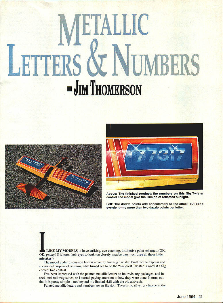
I like my models to have striking, eye-catching, distinctive paint schemes. (OK, gaudy! If it hurts their eyes to look too closely, maybe they won't see all those little mistakes.) The model under discussion here is a control-line Sig Twister, built to win — successfully — the "Gaudiest Twister" award at a Sig control-line contest.
The illusion of metallic lettering
Painted metallic letters and numbers are an illusion. There is no silver or chrome pigment — the mirror-like look is achieved by painting the way reflections would appear. Chrome letters simply show distorted reflections of sky, ground and nearby objects. On a curved surface (like the top of a wing), a letter will reflect sky colors at the top, shift to white where sunlight hits, then dim to gray and darken to a blue-gray toward the bottom. We duplicate that effect by starting with a white undercoat and spraying strips of color with an airbrush, feathering the transitions so they read as reflections.
Materials and tools
- Airbrush and thinner
- AeroGloss dope (lightweight; available in many colors)
- Colors used: Curtiss Blue (good coverage), Cub Yellow / International Orange / Stearman Red (thin, poor coverage over dark undercoats)
- Contact paper (or frisket paper if available)
- Glass sheet (for laying out contact paper)
- X-Acto knife with new #11 blade
- Metal straightedge
- Soft-lead pencil
- 3M Fineline masking tape (available at auto-supply stores)
- Regular masking tape and scrap paper/flyers for larger masking
- Brown paper bag (for cutting ray masks)
- Small brush for touch-ups
- Plastic scrubber (optional, for finish work)
Avoid using regular newspaper as a mask — the black ink can transfer to the model and is hard to remove.
Preparing masks and layout
- Use commercial lettering stencils or letter/number patterns laid out on contact paper.
- Remove the backing from the contact paper, stick the sheet to a flat piece of glass, and cut the letters with an X-Acto knife (new #11 blade).
- Use a metal straightedge for straight parts of letters; take great care cutting the curved parts.
- Lightly draw two pencil lines on the wing to mark the top and bottom of the numbers. These pencil lines help alignment and should remain faint.
- Mask the surrounding area with 3M Fineline tape, finishing with regular masking tape and pieces of a flyer or scrap paper.
Frisket paper is thinner and makes a smaller paint ridge than contact paper, but it costs more and is harder to find.
Painting the metallic effect — step-by-step
- Prime/undercoat the area in white where the letters and numbers will be. The white base is essential for bright highlights.
- Mix the sky blue by blending Curtiss Blue about half-and-half with white (adjust to suit; exact match isn't critical).
- Spray a stripe of sky blue about an inch wide, centered on each pencil line. Feather both sides. Make the bottom strip a bit heavier so it reads darker than the top strip.
- Let the dope dry thoroughly.
- Mask off the upper part of each letter where the bright highlight will remain. If you center the mask line exactly it often looks too low — adjust upward until it looks right.
- Make a darker mid-to-lower color by adding small amounts of black dope to your sky blue until you obtain a medium gray-blue. Spray this heavier over the lower masking line so the lower portion reads slightly darker than the top.
- To soften and blend the lower area, dump a little of the gray mixture from the airbrush bottle, add thinner, slosh it around, and make a couple of light passes over the bottom of the numbers to feather the transition.
- When fully dry, remove the masks from the upper parts of the letters, knock off the paint flash from the masking edges, remove pencil lines, and touch up any small spots with a tiny brush.
- Spray the clear cover coat, let it dry thoroughly, then remove masks and do final finish work (e.g., a light rub with a plastic scrubber if desired).
Key points: good masking, gradual color shifts, and feathered edges make the highlight and shadow read as reflections.
Dazzle points and rays
- Practice spraying small white spots with the airbrush (thin white, controlled bursts) before applying to the model.
- Add one or two small, feathered white dazzle points where sunlight would glint off the curved letter surfaces. Don't overdo it — most letters will have no more than one or two dazzle points.
- To paint rays from a main dazzle point: cut a skinny, four-pointed star from a brown paper bag. Mark a cross with 90° arms as a guide; the star doesn't need to be perfectly symmetrical.
- Orient the star at a 45° angle over the dazzle point and spray, applying more paint in the center than toward the tips. Subtlety works best.
Letters on a fuselage — horizon and ground reflections
When placing metallic letters on a fuselage, remember the lower part should reflect the ground toward the horizon:
- The dark line above the middle of the letter represents the horizon; it should be irregular rather than perfectly straight. A jagged torn edge from a paper bag makes a good horizon mask.
- Use a dark color for the horizon — for example, a dark green to represent distant trees.
- Colors below the horizon should represent the actual field surface you fly from. Many modelers use yellow/orange to simulate sand or red dirt, but if you fly from grass, concrete, or blacktop, use shades of green, brown, gray or black as appropriate.
- Next time you fly, look at car-bumper reflections to see what colors work best.
Final notes
The technique isn't difficult and can be applied to many color schemes to simulate chrome or polished-metal letters and numbers. The essential elements are a white undercoat, careful masking, feathered striping for gradual color shifts, and restrained highlights.
Transcribed from original scans by AI. Minor OCR errors may remain.

